Speed Up Your Capsule Hotel Reservation With The New Bobobox Booking!
Improving Bobobox’s booking experience — UX Case Study
Overview
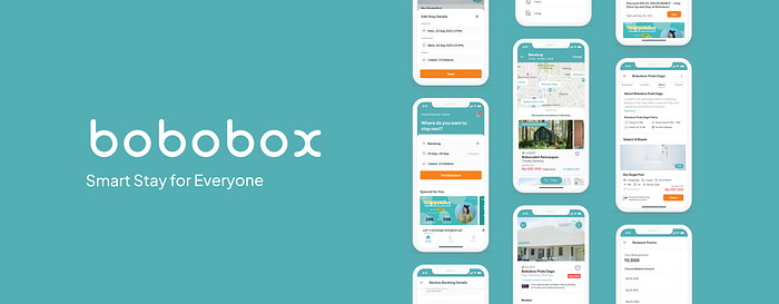
Bobobox is a one-of-a-kind product. It brings together capsule hotels and technological solutions to create an exceptional sleeping experience.
However, some inconveniences arise on the most important aspect of the application: the booking flow. In this project, I tried to examine the problem closer and elaborate approach, output, and outcome that were done throughout the refinement.
This project was done for two months under the pilot mentorship program from Design Jam Indonesia, mentored by Ravi Mahfunda. My role in this project is as a Product Designer.
Disclaimer: I do not work for Bobobox nor am affiliated with it. This is an exercise I do as an aspiring product designer who likes to solve problems and address suitable solutions.
Version used: Bobobox 3.3.10
Challenge & Limitations
I believe that booking orders play a key role in terms of increasing conversion in-app, and one of the ways to optimize the product function is through experience design.
This is also because the main app’s function at the moment is only to book and make adjustments related to the capsule room’s settings.
Other than that, one of the challenges that Bobobox faces at the moment is its very limited capacity rooms and the number of available accommodations that exist across cities.
Strategy
I started by creating a project plan that includes several approaches.

Here, I used three main checkpoints and documented each approach that I did.

Deep Dive Into The Problem
Yes, there are already plenty of accommodation booking apps out there.
However, Bobobox is different. It simply stands out from the crowd because both the app and the accommodation are under the same label, very uncommon compared to other conventional stays or hotels.
Thus, understanding the problems better is really crucial. Research is required to find the sweet spots between what customers really need and what the product of the Bobobox stay has to offer.
The objective of this research is to understand users’ mental model on booking stays, their past experience, and observe how users interact with existing Bobobox apps.
In this stage, I divided the research into two main categories.

Then, I prepared a research plan for each mini task.

The Designer’s Solo Research
As a designer, there are a couple of things that we can do on our own.
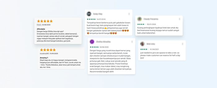
Read Store Review
One interesting thing that I found from reviews on AppStore and PlayStore is that people use the space for reviewing the accommodation instead of giving feedback for the application itself.
It’s such a waste to see scattered feedback for each individual stays and at the same time not enough feedback was given for the app.
Competitive Analysis
I also performed a competitive analysis to see the way competitors handle flow for their bookings.
Airbnb
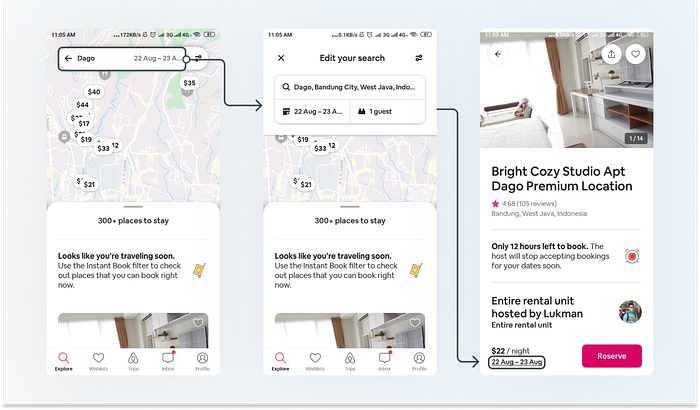
- Airbnb provides choices for users to rent a place in many forms and units
- Destination details are required upfront and can be edited after search results
- Place availability is shown by the active reserve button
Traveloka
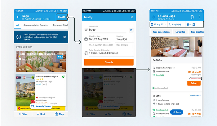
- Traveloka hotels allow users to look and book a hotel room to stay
- Users are required to input their destination details upfront
- Room availability is highly dependant on the hotel’s
- Showing status of rooms left
Agoda

- Agoda hotel is also one of the in-app products to book a hotel room
- Destination and stay details are required to fill upfront but can be edited after search results
- Lets users take a look at the already sold-out unit and guide to use another button
Personal Testing
For this approach, I’m focusing on trying out the booking flow and see how the current app handling sold-out rooms.
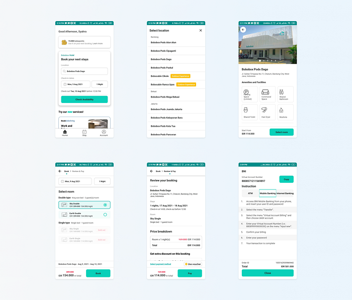
Then, I began by listing hypotheses of the problems based on my personal testing:
- Stay Selection. When selecting a place to stay, users have to read thoroughly each stay’s name and it is written in small typeface size
- Broken Flow (Loop). Direct availability check of the stay intends to create a faster flow but ended up leading to edge cases if the input scenarios are not in order
- Room Selection. The radio button for room selection does not provide details about the room or give clear presentation details of the room
- Hierarchy. On some of the screens, like review booking and payment instruction, do not highlight important information properly
Phew, after compiling all insights, now’s the time to move on and validate things from users’ shoes!~😄
When Designer Meets Users
I conducted online in-depth interviews and usability testing of the existing app with 5 participants.
Interview helps to gather underlying insights while usability testing gives an evaluation of the existing app.
Some of the main questions are listed below.
- Can you tell your story about your previous experience in booking a stay?
- What platforms did you use? Why?
- What makes you choose to book stays through online platforms?
- What kind of expectations that you have by booking stays online?
- When booking for a stay, what kind of things that you discover as the easiest and the hardest?
The criteria used for the participants include:
- Age 18–26
- Used online platforms to book a stay in the last 6 months

Sessions were done through Google Meet for 30–40 minutes.
Participants were also asked to download Bobobox to perform usability testing with the task:
Try to book a room for 2 nights in Bandung with room selection as you wish.
I also asked several happiness-related metrics questions to wrap up the meet.
Organizing Diverse Insights
Each answer from each individual (both from interview and usability testing) then map out using affinity mapping by clustering similar insights. Mapping helps to build patterns and address specific issues several users experience.
The final insights can be synthesized based on the big theme that each clusterization creates. (If you’re in the mood to see the whole map, click here)

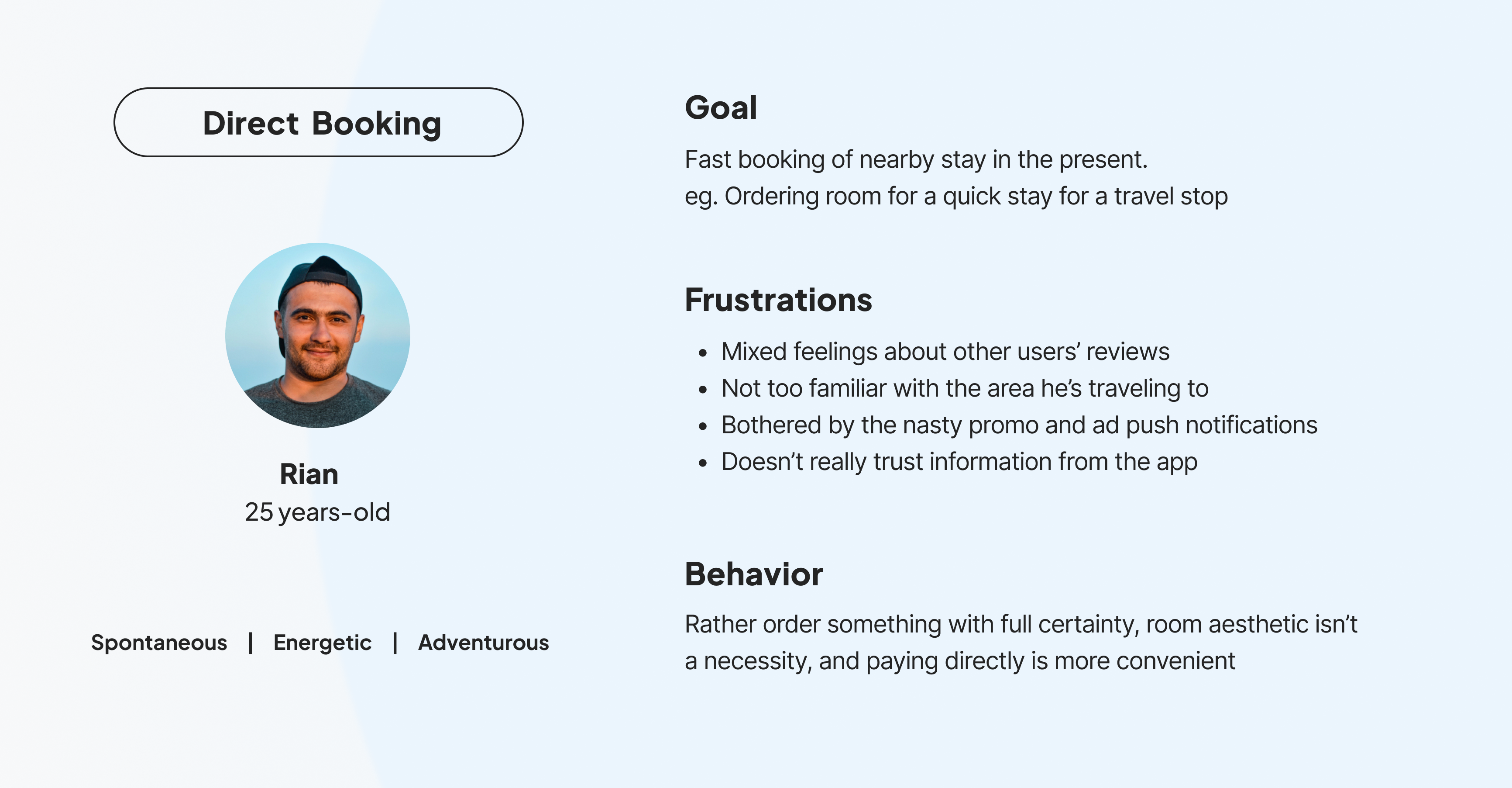
From talking to participants, I can uncover a lot of perspectives on their personal experiences of booking a stay. I can also categorize generally the two types of booking behavior from the participants, like Ayu and Rian here.

On the other side, usability testing results show that the problems users encounter are like tiny pebbles inside shoes. They’re not that huge to be seen with the eyes, but bother a lot when you are walking.
There was a memorable insight from a participant related to the scalability of the product that I discovered while conducting usability testing.
“Imagine this (Bobobox) opens in 33 provinces in this country. Do I really need to read one by one and scroll down to find my stay destination?”
- A, 22 yo
Here, I learned a lot that usability testing helps to ‘record’ impressions from task activity that was given to participants. Take a look at the takeaways from usability testing below.
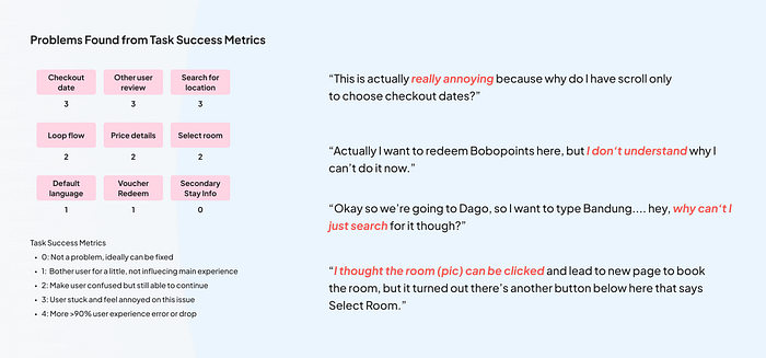
Other findings from post usability testing are also summarized here.

Many participants went through confusion about certain steps during the flow because the actions that they performed inside the app do not give the expected feedback behavior.
Most participants have heard about Bobobox and already know it as capsule hotels, but never stay at one. Another notable finding is that I discovered the difference between what participants say and what they do.
Some participants were impressed with the imagery the app provides and do not address their confusion during the usability testing.
What’s even more memorable, there’s one participant that stated she thought Bobobox is a store like Miniso because of its soft-colored and adorable branding. This finding wraps up research in a such fun way. 😄
Narrowing Down The Challenge
From insights organization, we can write a problem statement to help us highlight users’ goals. Here, I write it in the format of user role-goal-benefit.
As a user, I want to book a room easily, so that I can get a good place with the best deal to stay.
Then, to turn previous insights into something actionable, we can use the How Might We questions to trigger actions of what we can do towards the problem. I also use this to limit my scope of focus when making solutions for users.
How might we help users book a room easily?
From the parent HMW, I can break it down into a series of smaller HMWs to cover all of the problems that I have identified earlier in the research stage.

Exploring Possibilities
In this stage, I generated as many solutions for the problems I want to address. The goal is to prevent anchoring towards certain options and to be able to think about the solutions outside the box.
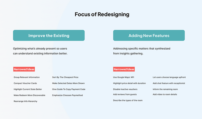
After creating 97 ideas, I start to filter which ideas are possible to implement as the right solutions for the problems discovered. Here, I use The Decision Matrix.
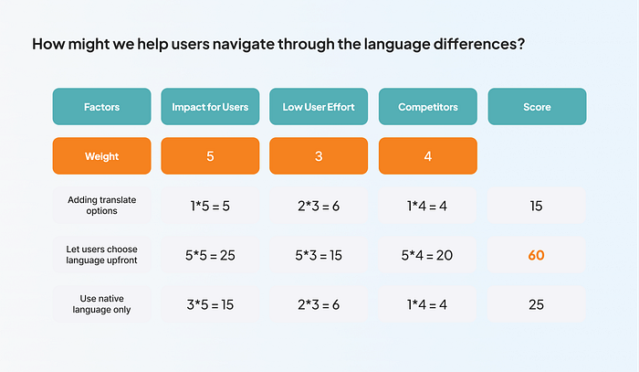
Calculating scores for each idea is possible by this approach. After determining the factors that need to be considered when making the decision, we can give a scale from 1–5 for each idea. Lastly, add weight and multiple for each factor because they’re not equally important.
By the end of the process, I already have curated ideas shown from the highest scores for each category. I successfully narrowed down 18 ideas summarized below.
Getting Into Mapping Flows
Mapping flows that users have to go through helps navigate me as a designer to spot where the problems that users face are taking place.
This also helps make important decisions on which part of the flow is essential for users that I can improve. The existing user journey of Bobobox is shown below.
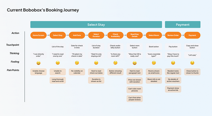
Because there are broken flows inside the existing app, I am trying to find alternatives by rearranging the sequence that forms the main booking flow.
Since the main pain point that users went through during user testing is the form at a home screen that checks the availability of specific locations, some changes need to be made to make the flow more seamless.

After giving several considerations, I decided to put the general input form of the city instead of the exact stay location on the home screen. Most users already know where they want to go and they have a specific location of the city that they want to visit.
Hence, search patterns of the city become more convenient rather than the obligatory reading thoroughly of the stay 1 by 1.
Extra steps don’t always mean difficulties. Extra steps could also mean enhancing clarity and emphasizing what matters and show what a product can offer its values to users.
PS. In this stage, I also learned how to simplify user flows to make them look on point and sleek. Previously, the user flow that I made was too “bulky” like this.

After discussing with other members in the mentorship and my mentor, I learned that I can improve its delivery. By grouping the same actions that users have to go through and labeling which flows that works as the primary and secondary, I can make the flow easier to read and understand.
Next Level Wireframes
Wireframing was divided into two stages: exploring and detailing. The division of wireframing helps to focus on each goal for each stage. This way, exploration can be done broadly without consuming too much time reassuring about the content of the screens.
Exploring
For wireframe exploration, I did not design the whole screens that are required.
Rather, I made block frames design of several screens that are critical and require a lot of consideration. These screens include the home screen, stay details, search result page, room details, payment details.
Here, I made a crazy 8 models to explore the variety of home screens that include the input form. In this phase, I conducted design critiques to gain feedback from my peers and mentor as early as possible.
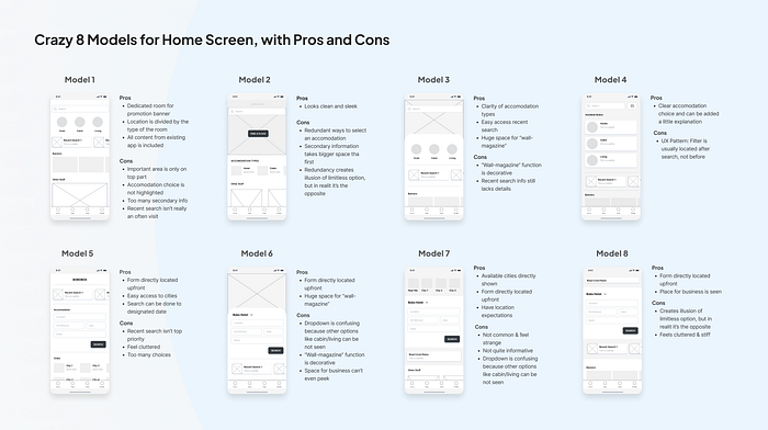
Then, I gathered all of the inputs I gained and created pros and cons for each design. Afterward, I design the alternative approach that covers all the pros of other screens and makes the cons close to zero. The final decisions are included in the wireframe detailing.
Detailing
Wireframe detailing is when things get more tailored. A final layout design added with an interactive prototype on this stage helps a lot to understand a bigger picture of the application.
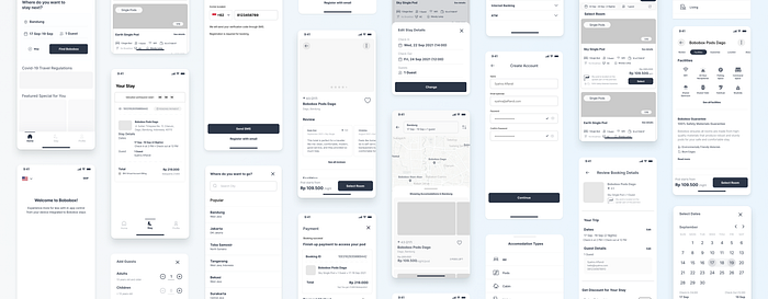
Detailing during wireframing also ensures each flow already makes sense for the user. Changing things when it’s already in high fidelity costs more than an attempt of detailing the wireframe.
Home Screen Detailing
Remember the Crazy8 exploration for the home screen? Below here, I tried to see how it's evolving after the real content is being squeezed in.

Search Result Page Detailing
I also created a new search result page that includes the surrounding area and shows the positions of each location of the accommodation.
From the interview, I discovered that when it comes to the stay location (not the city), users’ decision to book a stay highly depends on the surrounding areas of the location.
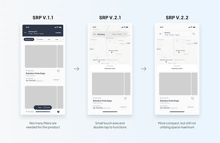
The new search result page helps users go to more specific locations they go to and prevent the loop flow that makes users go back more than twice to change the location. This enables scalability for upcoming branches of Bobobox in other cities as well.
Typography Detailing
Other than that, I also explored the typography hierarchy for the redesign.

Copy takes up to 70% portions of the screen, so it is crucial to choose wisely the right size for each content.
Using it during detailing helps to forecast what the copy will look like after the artistic touch.
However, this is not the final design and there is still absolutely room for iterations.
Once I make sure that all the steps that users need to pass appear logical and in order, I begin my journey with the colorful part.
(Of course, I didn’t finally use every text style involved. Keep on reading to find out about that😄)
Creating a Mini Design System

To bring the futuristic and modern interface, I tried to involve both soft and engaging artifacts throughout the design.
I tried to develop a modular design system based on reusable components and their states. The approach that I use is to flow as I go into the design. In the beginning, I worked on the two most important aspects: colors and typography.
Colors
There are so many color trials that I did. Initially, I planned to use the existing branding colors that I gathered from the mobile app and the desktop version. I decided to choose a new shade of the existing color instead to optimize its appearance on mobile devices, thus better for users.

Typography
From wireframe detailing, I used a lot of typography that consisted of 18 styles. However, after searching more on the topic, I learned that a design system should ensure scalability for the whole app.
Typography guidelines aim to create consistency for the whole system, thus using a lot of styles adds more and more diverse choices that are used infrequently.
After I do the reduction, now the typography only consists of 9 styles and there is less redundancy for the similar typography styles (that’s 50% less than the previous one!😄).
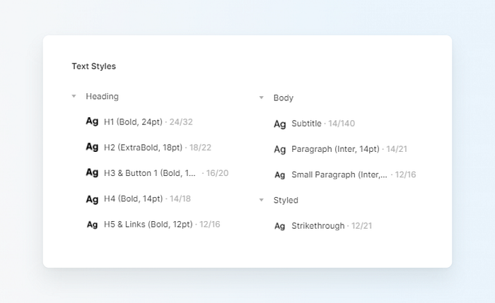
As for the revamp, I chose Plus Jakarta Sans as the main typeface to brings out the futuristic and sleek touch, combined with Inter for the long paragraph text so it’s easy to read.
I’m glad I could learn and use text styles more efficiently.
Iconography
As for icon choice, I am using Iconly 2.3 as the main icons, and adjust the other required icons by creating them on my own.
Iconography iterations occur on the section of the stay’s facility. On my first design, I used the filled ones because I wanted to highlight that it’s different from other icons in the app and represents that they’re not clickable.

However, after learning about this matter further I learned that maintaining consistency in design is really important.
This relates to the reliability of the product itself.
I changed it to outline icons to maintain consistency for the whole app and help to represent the unity of the product.
Illustrations
For the illustration, I use Bobobox’s branding on Instagram and try to draw from there as an example.
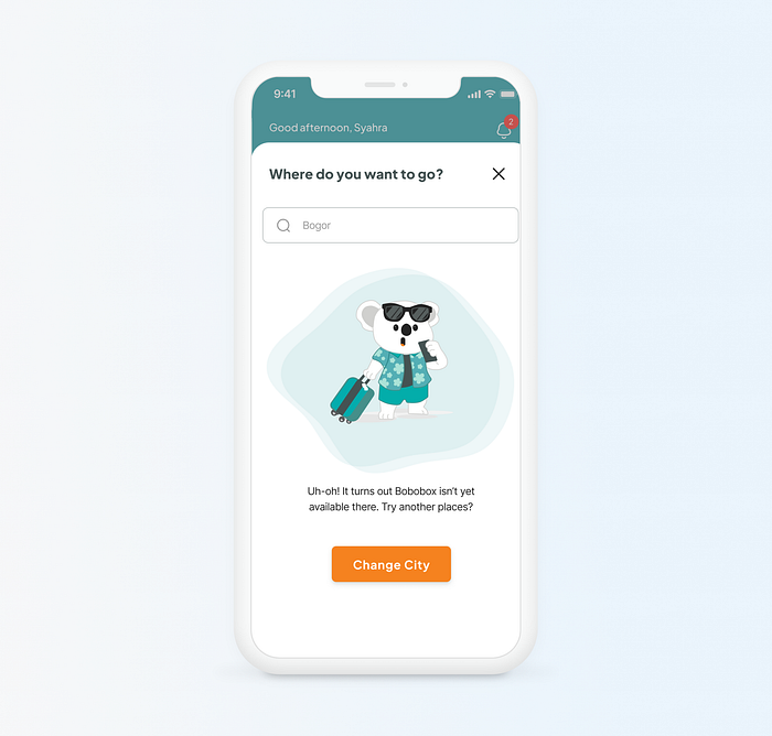
Illustrations are used in places where Bobobox is not enabled to meet the user’s request.
Here, if the search result of the designated city isn’t available, I can guide users to perform other actions. Illustration’s presence helps to uplift the experience by presenting empathy.
This is better than leaving the user alone in confusion after not finding anything.
Content & Copy
As for the photographs, I used pictures from the official web. I also changed the tagline from “Experience more for less” to “Smart Stay for Everyone”, to make it represent the product more. The tone of voice of the brand also leaning towards friendly, simple, and catchy.
Components
Components are very useful and powerful. Every component can be combined and rearranged with others. This ensures recognizable UI patterns for the users while maintaining design consistency.

Some UI Iterations
Several iterations were made to certain parts of the interface. These changes are related to the whole look and feel of the app.
1. Accommodation Card Proximity

I learned that proximity really helps drawing associations between each group.
Here, the price points look better after fixing out the whitespace.
Association to which accommodation also can be seen clearer than the previous one.
2. Above the Fold Area of Accommodation Details

I discovered that important sections like above the fold should be spent wisely because it’s where the eyes would land at first glance.
Thus I figured out to add more information that’s worth the user’s attention.
3. Highlighting Main Actions
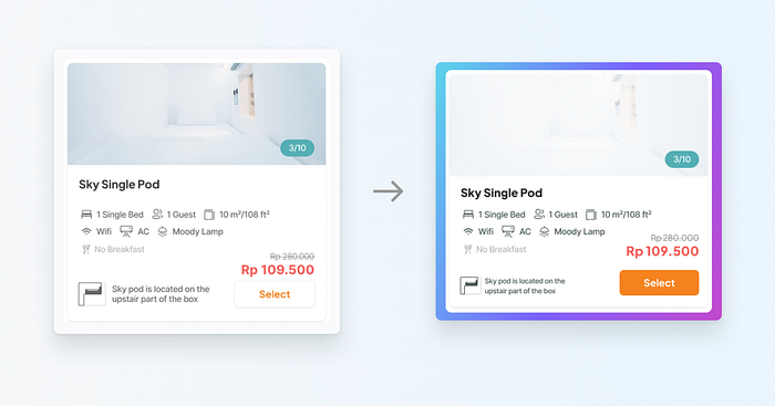
A change from the radio button to a secondary button does not highlight the main action because of its plain color (white, left).
The surrounding information also competes against each other.
The new button has the same behavior as other CTAs by redirecting to another page to avoid misfocus of the user and assuring them a clearer journey.
4. The Hierarchy at Payment

Even though the previous design already has all of the information users needs, it makes users jump from seeing one info to another.
By highlighting the utmost important things that matter, which in this case are the price and code for virtual payment, the screen is then rearranged into the right one.
Better hierarchy arrangements are useful and helpful for users to take action faster and more concisely.
Now let’s assemble everything and see it as a whole! 😄
Meet The Final Designs
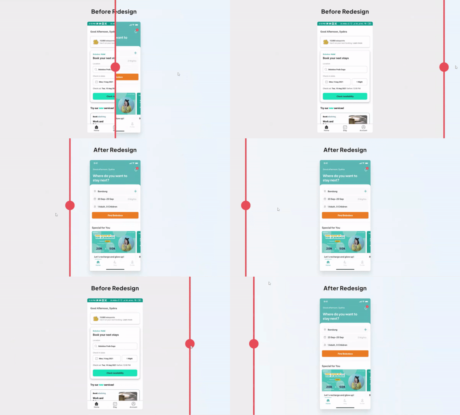
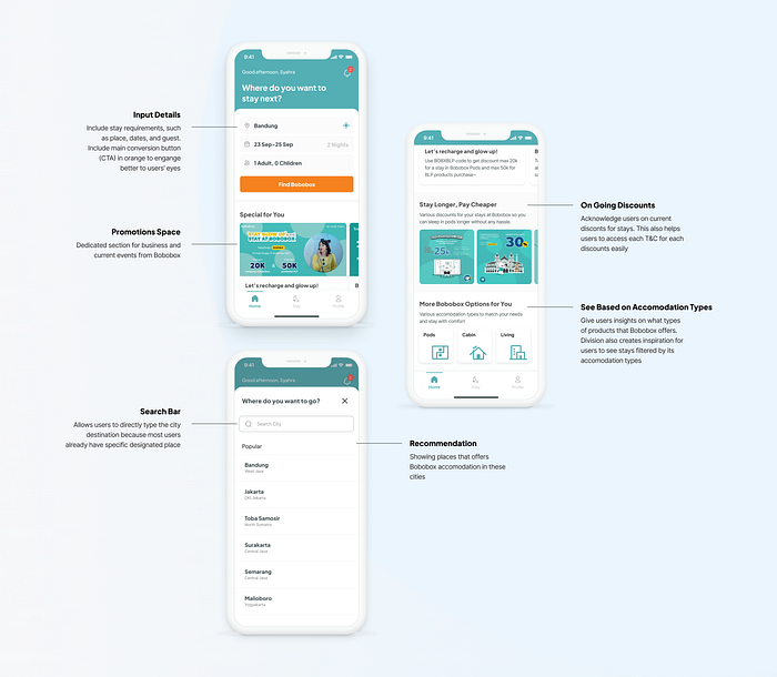
Home Screen
Highlighting forms with a question.

New: Search Result Page
The search result page allows users to explore accommodations despite their room availabilities. This enables users to look for alternatives of stay places, modify their stay details quickly and easily, as well as gather inspirations for their next stay.

Stay Details
Maximizing utility of existing space. Imbuing harmony through consistency.


Handling Sold Out: Upfront
The previous design didn’t inform upfront about room availability. Hence, the CTA is written as “Select Room” (like above in stay details). Redesigned version fix this confusion by guiding users to change details directly.


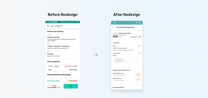
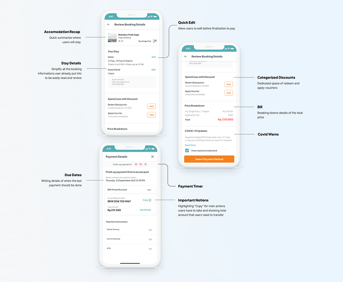
Reviewing Booking Details
Fixing architecture and hierarchy of information.
New: Adding Review After a Stay
This approach helps to gather scattered feedback for each stay into a neater and organized one, so dedicated feedback can be turned into actionable items by particular stays as well.

Connecting the Dots
I’m also creating wire flow and annotation of the final design to show the relationship between each screen presented. This will also provide help later on for engineers to develop the product.

Design Artifacts in Motion
Each video is divided based on the scenario activity that is then used during testing. (Btw, videos have no sound)
Seeing Design Directly on Users’ Hands!
After creating the prototypes, I conducted direct usability testing with 2 participants to gain insights from the redesigned booking flow.
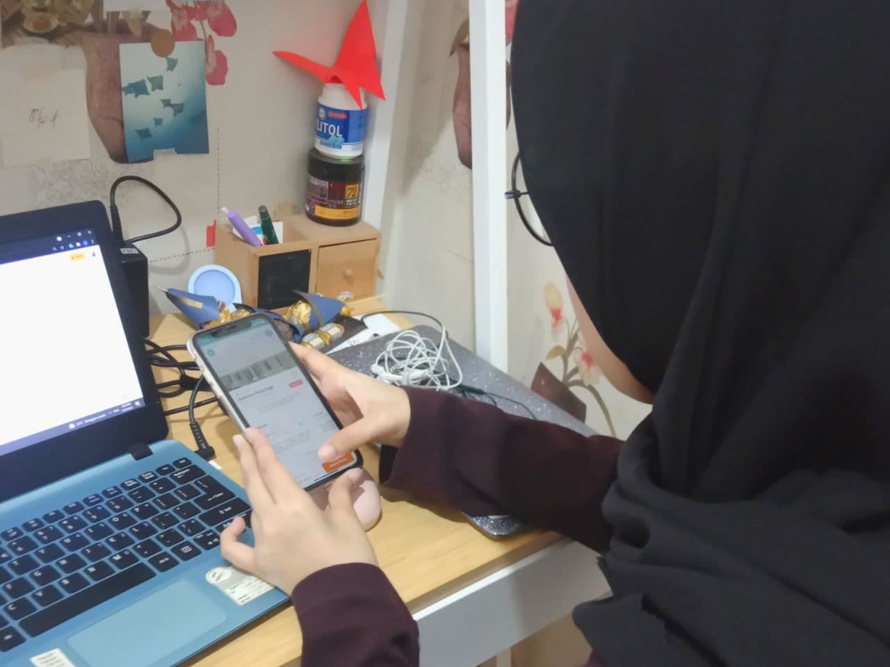
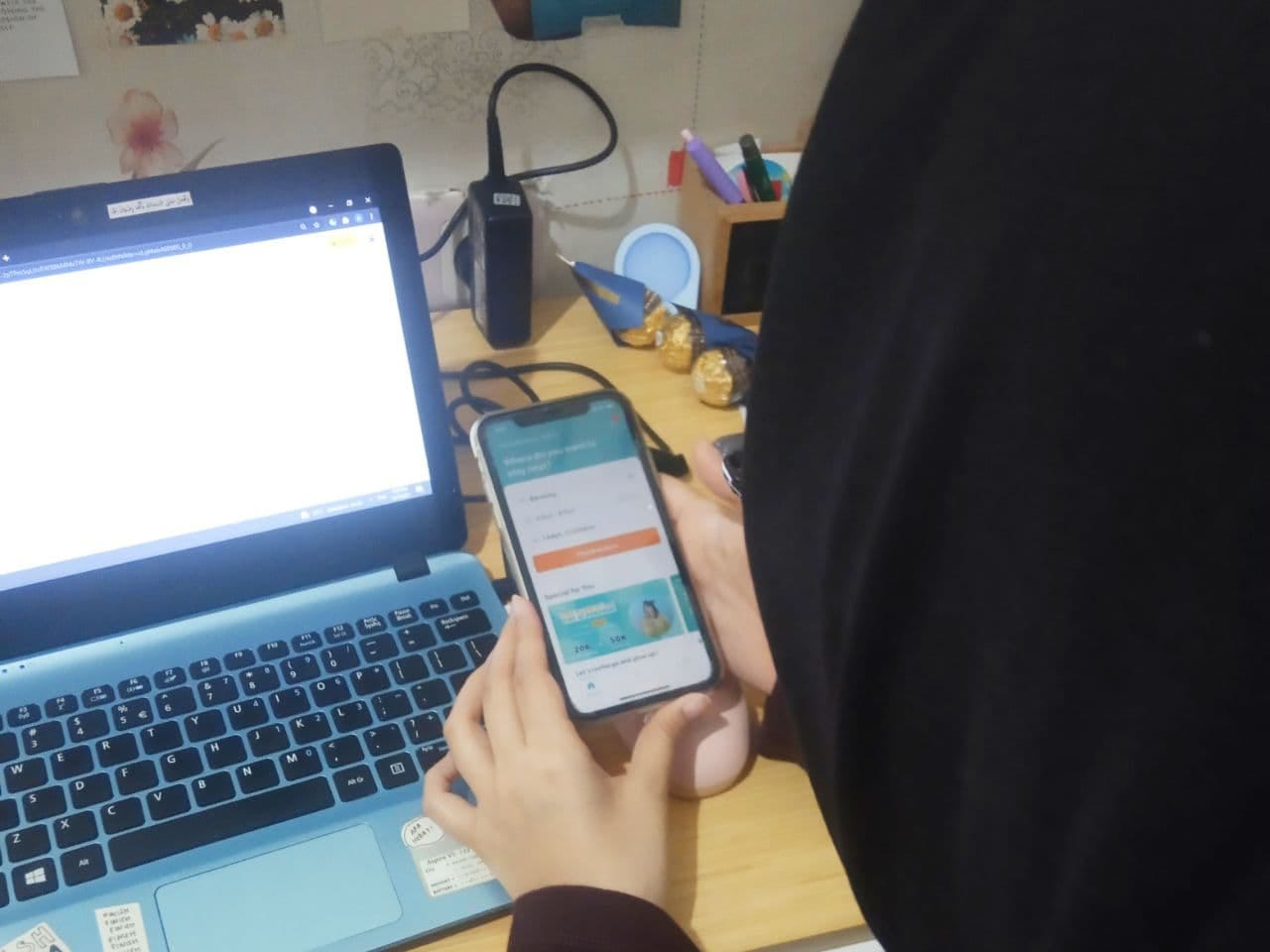
Overall, the steps are already smooth and intuitive, and participants don’t face constraints mentioned on the pre-redesigned usability testing.
That being said, several iterations were also made to emphasize the seamlessness of the flow after getting insights from usability testing. Detailed tasks and results can be seen here.
Date Picker
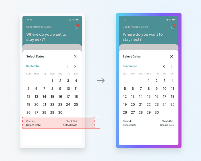
One of the participants mistakenly taps the ‘Select Date’.
Its text style is similar to an active link, and so was expected to give certain feedback and not static.
I changed its color and styles to remove the previous emphasis of the empty states of the date and use a different copy to guide users to pick a date.
Default Guest Number

Users had to go for a double click just to add a default one guest which is not efficient.
Other than that, users also had to face the discomfort of facing a disabled button.
The change was made to made default as 1 guest adult companies by active save button.
Bolder Sold Out Messages

One of the participants stated that she didn’t recognize the difference between sold-out accommodations instantly, even though the small cards already include labels.
I decided to put a huge announcement on the top bar to highlight the importance of changing stay details that disappears automatically after a few seconds.
Stars on Writing A Review

Both users automatically click on the stars instead of clicking the write review button.
I learned that giving reviews using stars is much easier and considered more important to users’ impressions rather than the to-the-point writings.
To help users meet their needs, I focused on rearranging the shape and give bigger room for the stars.
Conclusion
Bobobox is one of the rarest gems that offer IoT integrations to accommodation. They have gained a lot of trust which is very good, but it will be even better if this is supported with good experiences.
The existing concept is working, but still has room for refinement opportunities. I just make improvements specific to the booking flow.
Lesson Learned
In this project, I learned about giving better choices to users despite the physical accommodation limitations. This is important to build users’ interest.
Another important notion is that we as designers don’t need to sacrifice the creativity and craftsmanship of our products to make sure users understand product intentions. Instead, by giving a suitable context, we can provide them with better comprehension and give them a memorable experience.
Thanks for reading! Feel free to leave your feedback. I’m also open for further discussion, just reach me out :)
LinkedIn: www.linkedin.com/in/syahra/
Thanks to
Design Jam Indonesia for the Pilot Mentorship opportunity
Ravi Mahfunda for mentoring me along the way
Gia, Sahrul, Irfan, for the honest feedback during design critiques
